Designing great content (and getting links for it) is getting harder every year – of that there’s no doubt. What websites linked to in 2009 definitely wouldn’t see the same coverage today.
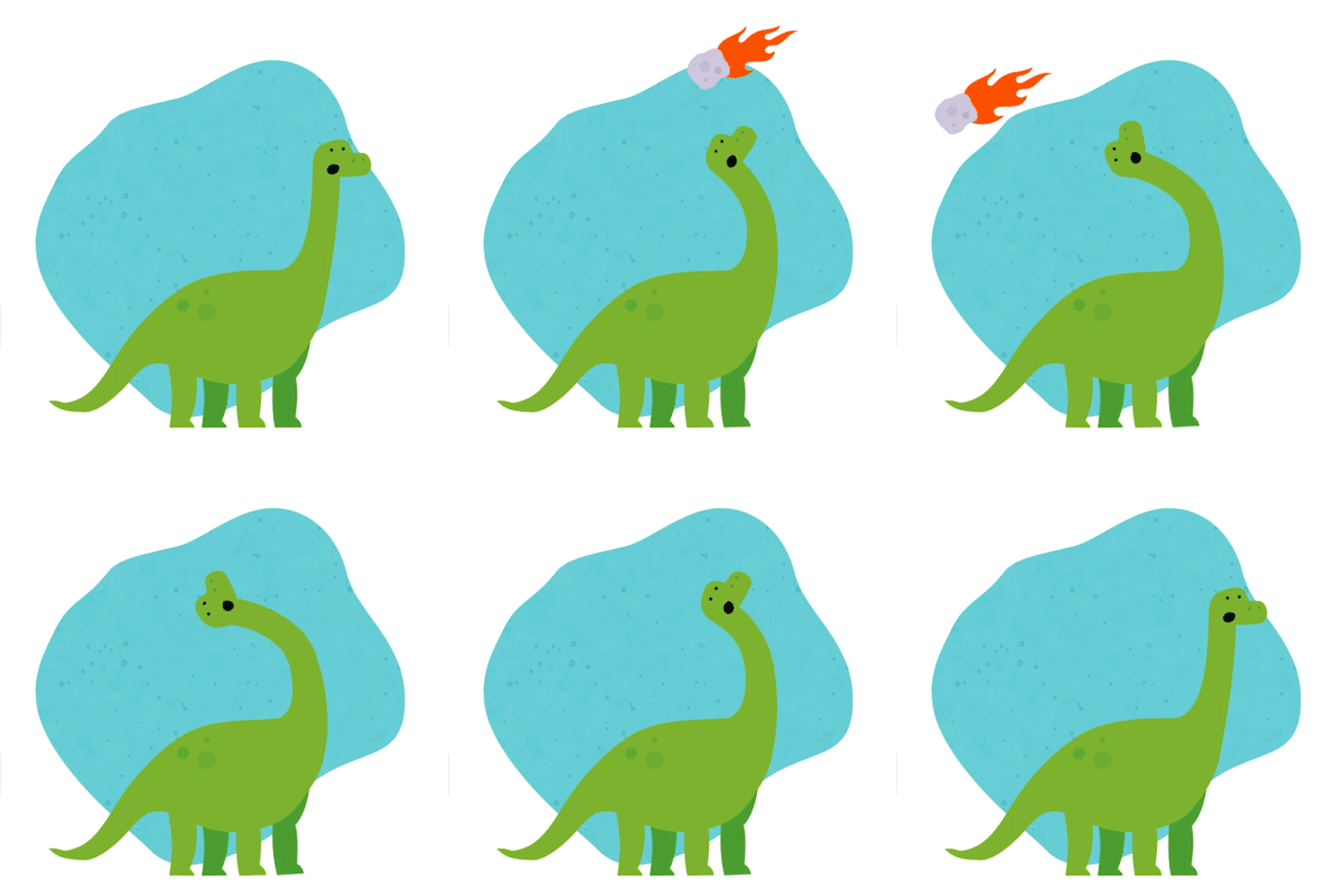
Just because an idea is awesome, doesn’t guarantee it success, especially if it’s presented in a bad or uninspired way. Put down your pie charts – extinction is coming for your content like an asteroid hurtling towards a peninsula, in Mexico… 65 million years ago.
The Hit List…
Long Infographics
Yeah, yeah infographics are dead, how many times have you read that this decade? Well, there’s some truth in that – the 15,000 pixel-high, bloated dinosaur packed full of tedious charts and figures is pretty much dead. They won’t survive the asteroid, but the little one, quietly scurrying around in the background? He’s going to inherit the earth.

So What Can You Do? Keep your infographics short, like the wily mammal – forget the behemoths of the past. If the subject genuinely demands a lot of space, then split them up into bite size sections. A website might only be interested in half of your data, so let them chop and choose with ease.
Even better, provide your outreach team (or the site you’re trying to nab a link off) with a media pack.
Create a Media Pack:
- The whole thing in one big infographic
- Split into sections (make sure your file names are relevant here e.g. not just “infographic-part1.jpg”, “infographic-part2.jpg”…)
- A title/featured image for their blog
- A short gif (if your piece lends itself to one)
- Simple images for social media sharing (AdJelly is a great place to help here)
- A high resolution and low resolution version of everything
Bloated Interactives
Interactive content is pretty special; we all love to spend 20 minutes checking out all the IMDB Marvel superhero data smashed up into a massive visualisation, don’t we? Well, maybe on desktop, but on mobile you’d normally be served up an unreadable mess, or if you’re lucky – a watered down version. Add in the fact that interactives take a heck of a long time to make and you may find you never bag enough links to justify the cost.

So What Can You Do? Simplify and downsize. Choose one thing you want to visualise; if it doesn’t work on mobile it’s not going to bag as many links. If you’ve got a killer idea where you’ve considered mobile first, you’re onto a winner.
The Survivors…
Surveys & Data
Some of our biggest hits this year have come from simple number crunching or analysing survey data. So long as you can pull headline-bagging stories from the data, you’ll get those links. Simple visualisations are all you need, but make sure you supply the raw data to journalists and bloggers as well.
Maps
Truth be told, we’ve had hit and miss results with maps, but we’ve found a framework which allows us to quickly put together maps with slides. With a decent setup, you can throw in some copy and images, make some appropriate style changes and get a map together in just a few hours. This approach will get you a decent interactive at a fraction of the cost – and therefore minimise the risk. And don’t forget that a static map can also tell an interesting story.

Top Tip: Sometimes, even the best maps don’t bag links. We’ve found that the people responsible for posting on sites aren’t always as tech savvy as you’d like. Even a well explained embed code can be too complicated for them, or perhaps their CMS doesn’t allow raw html or iframes. Offering a static version compiled as a set of images can help seal the deal. Aaand it gives them a reason to link: “See the interactive at …” and so forth.
Videos & Animation
Video can be expensive and not all clients can afford it, but there are tools out there to cut the time (and budget) down to a more attractive size. Adobe Spark (free to Adobe CC members) has a few options including Video Stories and Spark Pages; both drag-and-drop tools that, provided a designer is involved, can be surprisingly effective.
Canva and Crello also provide simple video/animations that are aimed more at the social media end of the spectrum. Both require minimal setup and are simple enough for non-designers to get on with.
And, if you are a designer, who has never opened After Effects: Take. The. Leap. If you know your way around CC, it’ll take you 4-5 hours to get to grips with animation. You won’t be excellent at it, but you’ll be amazed at what you can create after just a few hours.

Top Tip: For designers; take a section from an existing infographic and turn it into an animation. Simply throw in some motion, subtitles and a few effects. This adds instant value to a piece and helps your outreach team tempt potential websites to link. Huzzah!
Web Stories
Mentioned briefly above, these are basically collaborations between copywriters and designers where you get a much more interactive experience. You’re not just served up an infographic and an article, you get more of an experience. Here, it’s the collaboration part that pays off; a mixture of engaging copy, parallax effects and stunning visuals.


