In the race to the top of the SERPs, many digital marketers often forget that websites are built for humans, and not just for Google.
In the past, good practice SEO checklists combined with a creative content strategy could get great results, but recent Google updates have shown that if you’re not investing in UX optimisation (user experience), then you’re missing a trick.
OK, Slow Down… What is UX?
UX stands for “User Experience”, but what does that actually mean? Well, in a nutshell, UX is how your users feel as they navigate around your site. Whilst the ultimate aim of any website is for visitors to “convert” (e.g. invest in a product, service or brand), UX is more focused on how that process makes them feel and leads them to that end goal.
Ultimately, if the process is frustrating, annoying or just plain broken, then the user will rarely convert (or have a horrible time doing so), but if your users have a fantastic experience then clearly you’re going to get their business!

Why is Google interested in UX all of a sudden?
In fairness, Google has always been interested in the user – its very reason for existence (no cynicism here) was to organise the web and make it navigable for users; getting the best results to the top of its search engine, with humans in mind.
Lately, however, Google has been increasingly focused on your website’s “Core Vitals” (measuring speed, responsiveness, visual stability and so on). And with each update, Google is striving to make your sites more human, making them “delightful”, even…
“Optimizing for these factors makes the web more delightful for users across all web browsers and surfaces, and helps sites evolve towards user expectations on mobile.”
– Evaluating page experience for a better web
So, how do I make my website more human?
It’s a strange one, isn’t it? Humans create products, we write copy, take photos, and we stick them all together in a website. Yet somehow, at the end of the process they can still be considered “not human enough” by one of Google’s bots.
For various reasons, whether it’s lack of budget or time, lack of creativity, or a myriad other things, we can fail to see the bigger picture.
Little Moments of Joy
Often the bigger picture means looking at the smaller details. Think again about what user experience means; it’s how people “feel” when they use your site. What happens when they click that “buy now” button, or get lost and hit a 404? Just how are you going to ensure you delight and assist your users at every step of the way? Let’s look at some examples…
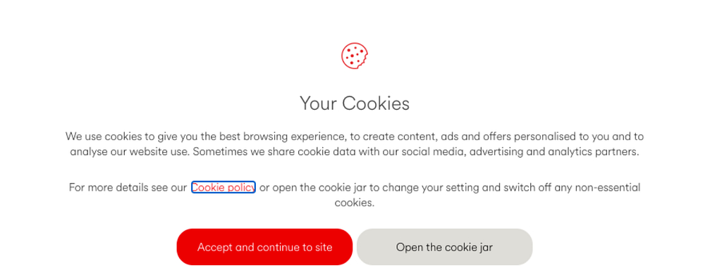
Cookie notices annoy the hell out of everyone, popping up all over the place, asking you to make a choice you have no idea about, and eventually just clicking “accept”. So here, first impressions count.
Love ‘em or hate ‘em, Virgin Media adds a touch of playfulness here by suggesting you “Open the cookie jar” which sets the tone for the rest of the site.
It might seem like a little thing, but being polite and grateful to the buyer can improve the user’s mood considerably. It’s amazing just how many “add to basket” clicks result in a boring old “added to basket” message.
Come on, get your developer to change it, it only takes a few minutes! Even better, congratulate the customer on their excellent choice or taste!

In addition to the above, why do we even call it a “cart” or a “basket” anyway? Both are quite sterile, salesy and samey. Perhaps it’s time to mix it up a bit, adding a more familiar touch, such as
Patagonia’s “Add to Bag” helps bridge this disconnect. What else could we add items to, I wonder?
Free delivery is everywhere these days, but it doesn’t mean we can’t shout about it, or even “celebrate” it. Yey! There’s so much fun to be had on the Lego site, but the little interactions and messages really bolster their philosophy, even on an otherwise boring checkout page.
Minimise Frustration
A frustrated user is unlikely to last very long on your site, which means they’re also less likely to convert. Ensuring there are fewer opportunities for frustration and being as helpful as possible when it does happen is the key to success.
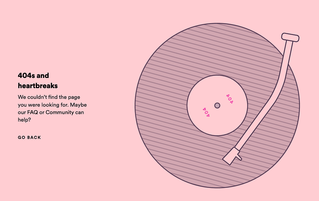
Sometimes pages disappear and aren’t redirected, which can land you on a 404 page, which can be a frustrating experience. Other times website search results turn up with no results, which can, again, throw you to a similar page. Adding useful links and clear messaging can alleviate some of this frustration and get your lost customers back on track.
Doing it with a touch of personality is even better!
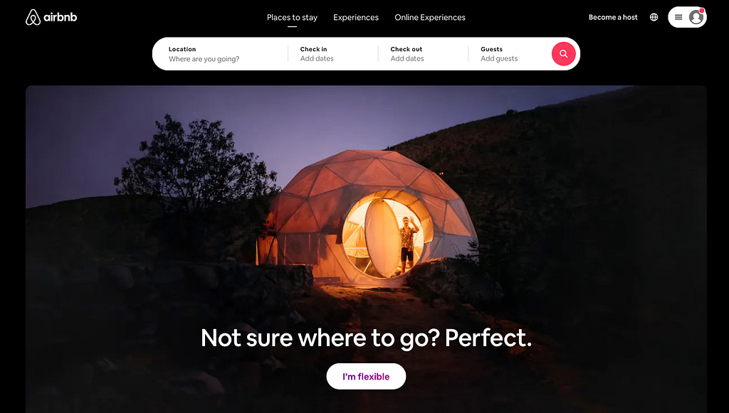
Considering the size and scope of Airbnb, you might assume their site would be a clutter of offers, listings, blog posts etc. But their site is a shining example of simplicity. Everything is paired back and the booking system is flawlessly user-friendly, meaning the only frustration is finding out your temporary neighbours are noisy!
Personalise
If you’re a regular to a website, chances are they know what you like to buy, they’ve got your purchase history after all! But that doesn’t mean the website can’t treat you like a valued customer.

Sure, there are LOTS of reasons to dislike Amazon, boycott them even. But… there’s a little touch on their site that I’ve always liked, which seems like a simple thing to implement… that little “Hello, Peter” (insert your own name, obvs) where your account details are. Amazon actually refer to you by name throughout their site, whether it’s to sell you credit, promote offers or a thousand other things. It clearly works.

If the user is a first time customer, perhaps they’ll need a little more help than usual? That’s where product “finders” or “builders” can really help. They act in many ways like a shop assistant, asking questions in a more human way than a filter until you have enough options to make a choice. The builder at Deciem even asks your name, so it can use it later in the results. Neat.
What did we learn about UX optimisation?
Keen to figure out just how user-friendly your website can be whilst still remaining SEO optimised, but don’t quite know where to start with a UX audit? Our friendly team of SEO experts and experienced designers are always on hand to collaborate and help, just give us a call.
